Custom Editorial Experience
The Localization Service provides an editorial interface that allows editors to manage the localized values of an entity. By default, each field is displayed as either a single-line text input (TEXTBOX) or a multi-line text input (TEXTAREA), resulting in a UI like this:
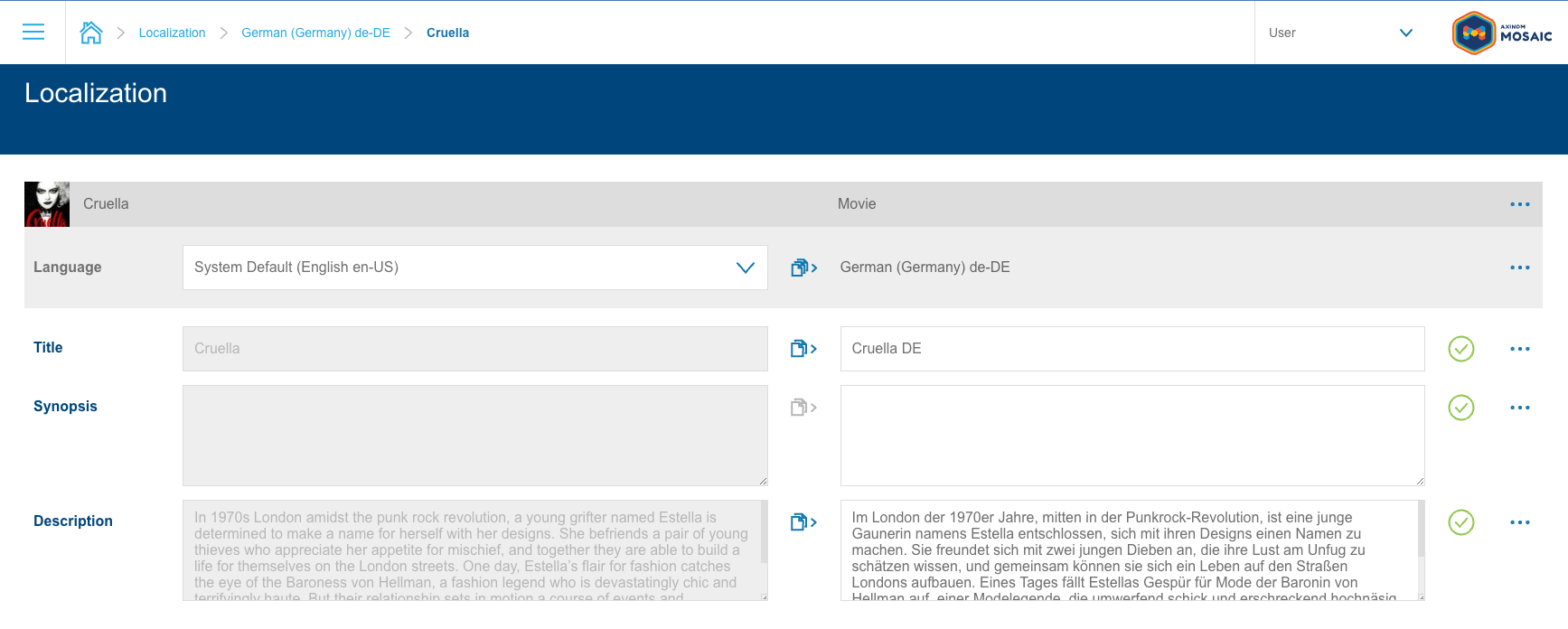
However, these options may not always provide the best user experience — especially when dealing with fields such as dates, color values, or references to related entities like images. In such cases, the Localization Service allows the definition of a custom editing component for a field.
Defining a Custom Editorial Experience
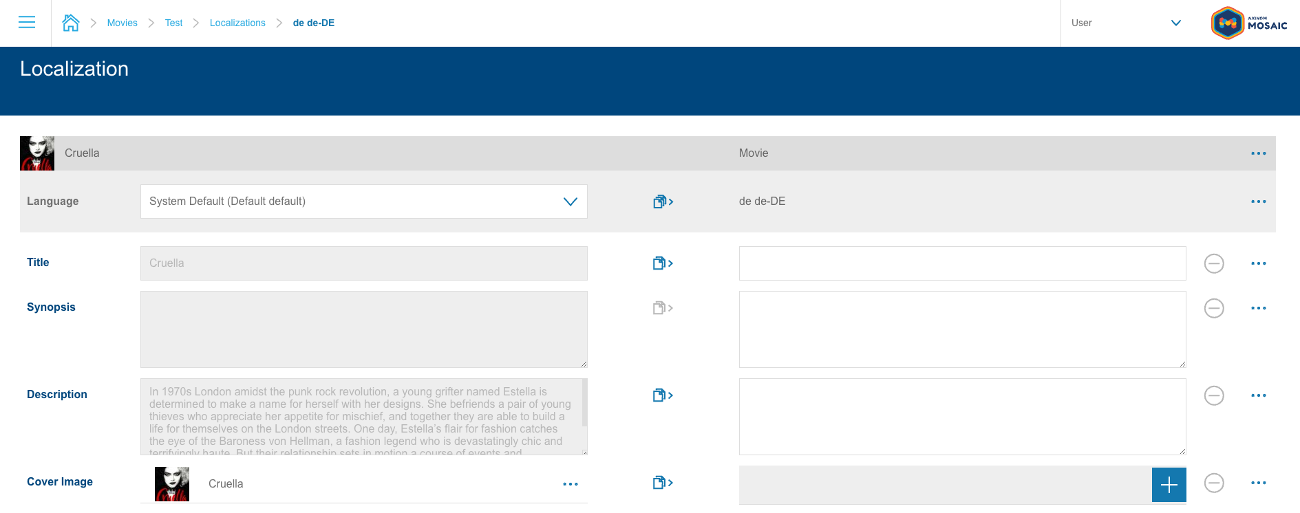
Consider the scenario of localizing the cover image of a movie. The cover image is stored as an entity in the Image Service, with its ID being the only reference known to our service. If we register the field like any other with the Localization Service, the default experience would look like this:

While technically functional, requiring the editor to remember and manually input the image ID is not ideal. A richer experience that enables users to view and select images more conveniently would be preferable, such as this:

Implementation
In the example above, the 'Cover Image' field is displayed using a custom component for both viewing and editing. This was achieved with the following entity field definition:
{
    field_name: 'coverImage',
    field_type: 'STRING',
    title: 'Cover Image',
    description: 'The cover image of the movie.',
    sort_index: 4,
    ui_field_type: 'CUSTOM',
    ui_field_custom_definition: {
        fallback_type: 'TEXTBOX',
        view: {
            component: 'single-image-select-field',
            props: {
                disabled: true,
                inlineMode: true,
            },
        },
        edit: {
            component: 'single-image-select-field',
            props: {
                title: 'Select Localized Movie Cover Image',
                imageType: 'movie_cover',
                inlineMode: true,
            },
            property_map: {
                locale: 'defaultFilterTag',
            },
        },
    },
},
This definition is sent to the Localization Service as part of the DeclareEntityDefinition message used to register the entity.
Like any other field, the definition includes standard properties such as field_name, field_type, title, description, and sort_index. The key part is setting ui_field_type to CUSTOM, which instructs the Localization Service to use a custom editorial experience. The ui_field_custom_definition property then defines this experience.
Key Properties of ui_field_custom_definition
fallback_type(required) - Specifies the fallback UI type if the custom component is unavailable.view/edit- Defines the UI component used for viewing and editing values:component- The name of a microfrontend extension. This can be a custom service component or a pre-built one from a Mosaic managed service.props- Additional properties passed to the component.property_map- Maps default Localization Service properties (e.g.,locale,value,onChange) to different names expected by the component.
The properties the Localization Service will send to the component can be found on the typedoc of UiFieldCustomDefinitionEditPropertyMap and UiFieldCustomDefinitionViewPropertyMap.
Please note, that when defining a mapping for the onChange property, you need to define a on_change attribute in the property_map object, since the properties on messages are in snake_case. 😇
Breakdown of the Example
-
Fallback Experience: The fallback_type is set to
TEXTBOX, ensuring a functional UI even if the custom component is unavailable. -
View Mode: The
viewconfiguration specifies to make use of thesingle-image-select-fieldand passing props to it, preventing modifications (disabled: true) and hiding the field label (inlineMode: true). -
Edit Mode: The
editconfiguration uses the same component as theview, not settingdisabled: truebut instead passing atitleandìmageTypeprop, that the component will use when showing the image select explorer. Additionally, theproperty_mapensures thelocaleis mapped to thedefaultFilterTagprop, filtering images on the select explorer by locale-specific tags. ThevalueandonChangeprops do not need to be rebound, since thesingle-image-select-fieldimplements them like this already.
Conclusion
That's it! With this setup, the Localization Service renders the custom component, allowing editors to select images from the Image Service in a more user-friendly way:
Further Information
For more details on available options, refer to the API documentation for DeclareEntityDefinition and UiFieldCustomDefinition.
Ensure that the component value corresponds to a valid microfrontend extension. The Localization Service expects the component to implement:
- A
valueprop to receive the current field value. - An
onChangeprop, which should be called with the new value whenever the user makes a change.
The onChange function can be called with either an object containing the new value as event.currentTarget.value or directly with the new value itself.